

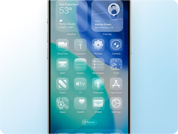
Apple recently introduced a new visual style called Liquid Glass, featuring “liquid-like” transparency, reflections, and blurred backgrounds. In essence, it’s a mix of translucent and dynamic UI elements that reflect and refract their surroundings to give prominence to content.
If you’re in email marketing, you’re probably asking: how does this affect the emails we design?
Let’s be clear upfront: you can’t directly reproduce the Liquid Glass effect in emails using HTML and CSS. In this article, we’ll break down what’s possible, what’s not, and how you can draw inspiration from this style without compromising readability or accessibility.
What is Liquid Glass?
Liquid Glass is a refined take on the glassmorphism trend – think translucent layers, soft blurs, and subtle highlights that create visual depth. What sets Apple’s version apart is its responsive and dynamic nature: it adapts to content and context in real time. That’s something we simply can’t replicate in email environments.
Interestingly, this isn’t the first time we’ve seen a tech giant experiment with translucent UI. Remember Windows Vista’s Aero Glass (2006)? Microsoft introduced semi-transparent windows with blur effects, promising a visual revolution. The results were divisive: some praised the look, others criticized its impact on performance and usability. The comparison is apt: once again, a big player is doubling down on visual flair, and opinions in the design community are mixed.
Why can’t we use it directly in emails?
Simple. Most of the email clients (at the time of writting this article) don’t support the necessary technologies (especially the CSS property backdrop-filter). So any attempt to reproduce the Liquid Glass effect in real time using HTML/CSS in email is technically unfeasible.
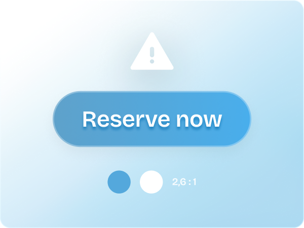
The alternative with static images
Your only viable option is to simulate the effect using static visuals. This means creating blurred, translucent-looking elements (e.g. buttons, backgrounds) ahead of time in Figma or Photoshop and embedding them into your email as images.
But even this method comes with a red flag:
- You must always include meaningful alt text so essential messages aren’t lost.
- Always define solid fallback background colors in case the images don’t load.

Readability first
Email exists to communicate quickly and clearly. Even with a visual twist, clarity and text contrast remain non-negotiable. Using vivid backgrounds with light text can backfire if the contrast isn’t high enough.
Always test readability under real conditions – on mobile, in direct sunlight, and in dark mode. Use dark overlays and enough blur on background images to ensure text remains easy to read in any context.
Accessibility is not optional
A visually pleasing email is worthless if it excludes part of your audience. People with low vision, color blindness, or other impairments rely on high contrast and accessible markup.
Here’s how to stay compliant and inclusive:
- Avoid placing critical information solely in visuals.
- Use accessibility testing tools to check contrast ratios and structure.
- Reference and comply with WCAG guidelines.
We have written a more extensively on accessibility and compliance in our dedicated article on the European Accessibility Act (EAA), which is particularly relevant if your emails reach users in the EU.
Embrace the aesthetic, carefully
You can be inspired by Liquid Glass without going overboard. Use it selectively – think hero headers, call-to-action buttons, or content highlights. You don’t need to reimagine your entire layout. Balance is key. A modern look is great, but never at the expense of usability.
Final thoughts
Apple’s Liquid Glass is elegant, futuristic, and visually engaging – but it cannot be implemented directly in email. The good news? With creativity and some smart workarounds, you can channel the spirit of the style in ways that respect the technical and accessibility limitations of the medium.
Email is still about communicating clearly and inclusively. A trend is only worth pursuing if it elevates, not hinders, your message. So by all means, let your emails shine. Just make sure they still deliver!


