

“Can I use my brand’s font in my email?” – This is a very legitimate question, and one we hear often when building a new email for a client. The answer isn’t as straightforward as you might expect.
Let us explain why.
Delivery is yours. Display is theirs.
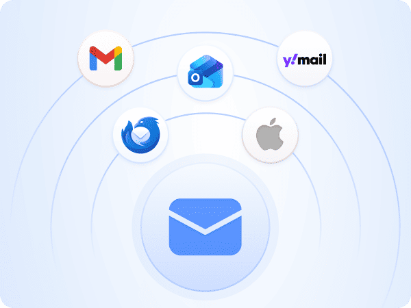
When you send an email, you don’t control how it’s displayed. That job belongs to the email client, the app or program your reader uses to open it. Gmail, Outlook, Apple Mail, Samsung Mail – you probably know them well, and each one interprets your email in its own way, following its own set of rules.
Think of it this way: imagine you write a document and ask 10 different people to read it out loud. Each one has their own accent, their own pace, and some of them skip parts they don’t quite understand. The document is the same, but the experience is different for each person.
The exact same thing happens with fonts. You can specify that your email should use your brand’s custom font, but if your reader’s email client doesn’t know what to do with that instruction, or simply chooses to ignore it, the result is something else entirely. This is one of the core challenges when working with custom fonts in email. Usually, the fallback is a generic font like Arial, or worse, Times New Roman.
This isn’t a bug. It isn’t a mistake. It’s simply how an ecosystem works when there is no single standard that every email client follows in the same way.
Difference between typeface, font family and font
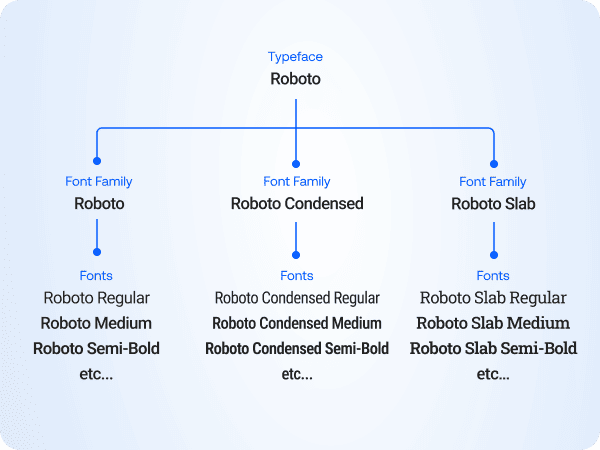
One thing I always like to explain to my clients – not to sound technical, but because it genuinely helps communication, even internally with their design team – is the difference between typeface, font family, and font.
These terms are often used interchangeably, but they don’t mean the same thing.
Typeface is the visual design of a set of letters. It’s the creative work – the look and feel. When you say “we use Helvetica as our brand typeface”, you’re referring to its style and personality.
Font family is how that typeface is grouped and used in practice. In most cases, it shares the same name – like Helvetica – but refers to the full set of variations available.
Font is one specific version within that family. For example, Helvetica Bold or Helvetica Light Italic. Each of these is a separate font, typically a separate file.
In simple terms:
- Typeface: the design
- Font family: the group (the name you use)
- Font: one specific style
I could go into more detail and turn this into a full design lesson, but that’s outside the scope of this article. With a background in graphic design, I find this distinction particularly useful. If you’re interested in learning more, check the font theory article by Really Good Designs.
System fonts, Email safe fonts vs Web fonts
In email, not all fonts behave the same way. The difference comes down to where the font lives and whether the email client can access it.
System fonts are fonts that exist on specific operating systems. For example, Helvetica is common on macOS, while Calibri and Segoe UI are standard on Windows. These can look great, but they are not guaranteed to render consistently across devices.
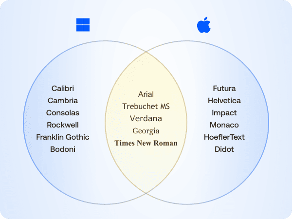
Email safe fonts are the gold standard. These are fonts that are widely supported across email clients and devices, such as Arial, Georgia, Verdana, Trebuchet MS, and Times New Roman. They render consistently in most environments, which is exactly what makes them reliable.
Web fonts are loaded from external sources such as Google Fonts, Adobe Fonts, or your brand’s own hosted files. In most cases, these are the fonts you’ll want to use. They allow for more expressive, on-brand design and give you greater creative control. The catch: the email client has to be willing to fetch them, and as you’ll see in the next section, most of the big ones aren’t.
Who actually supports web fonts?
This is the part that surprises most people. Web font support in email clients is, to put it kindly, inconsistent. Here’s where things stand:
| Email client | Web font support |
|---|---|
| Apple Mail (Mac) | Yes |
| iOS Mail (iPhone/iPad) | Yes |
| Outlook for Mac | Limited |
| Outlook App (iOS & Android) | Limited |
| Outlook for Windows | No |
| Gmail (all platforms) | No |
| Samsung Mail | No |
| Yahoo! Mail | No |
The pattern here is hard to miss. Web fonts work reliably in the Apple ecosystem, and almost nowhere else. Gmail alone accounts for a significant share of email opens worldwide. Outlook dominates the corporate and B2B space, and Samsung Mail comes pre-installed on hundreds of millions of Android devices.
This doesn’t mean you shouldn’t use web fonts. It means you need to make an informed decision, based on who your audience actually is and where they open your emails. A B2C brand with a predominantly iPhone audience has a very different reality than a B2B company whose clients are mostly on Windows with Outlook.
The good news is that there are ways to handle unsupported clients gracefully. That’s exactly what we’ll cover next.
Solutions
Font stack / Fallback
Define the custom font alongside a set of safe fallback fonts. When a web font isn’t supported, the email client will automatically render the next available option, ensuring consistent readability across environments. In older versions of Outlook, which rely on the Word rendering engine and do not support web fonts, fallbacks must be carefully selected to avoid unexpected typography issues (otherwise it may default to Times New Roman).
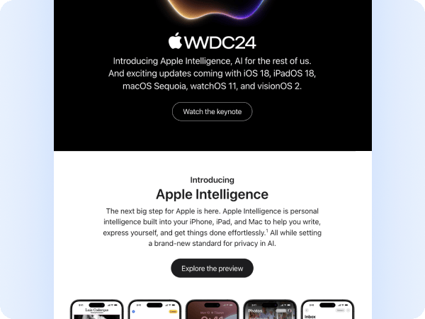
This approach works best when you have a clear understanding of your audience. For example, companies like Apple, often design for an audience deeply embedded in their own ecosystem. In these cases, web fonts are more likely to render as intended. However, support is never guaranteed. When the same email is opened on unsupported clients, fallback fonts will take over, and the visual result may differ from the original design.
Banner image with text
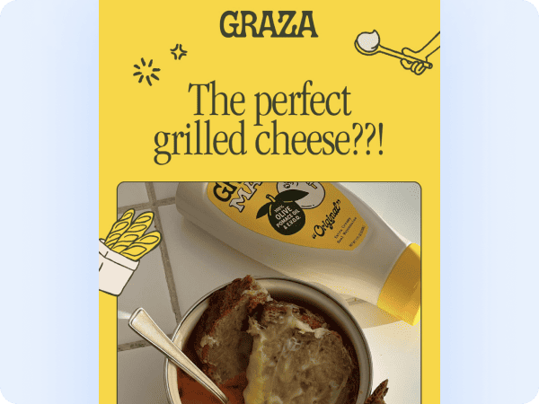
This approach is widely used, and often executed poorly. Some brands aim to replicate their website exactly, turning the entire email into a single image with embedded text. While this may look acceptable on desktop, it can quickly become unreadable on mobile if not handled carefully.
For screen reader users, a full-image email without proper aria-label and alt text is a complete dead end, the content simply won’t be readable.
When done properly with strong contrast, a balanced layout, and mobile testing this approach can be super effective. It is often combined with email safe fonts in the body to garantee compatibility beyond the hero section.
Text as image (PNG)
Best suited for titles. This approach uses your brand’s custom font in image form for key titles, while keeping the body text in email safe fonts. Alt text and aria-label attributes are essential, not optional.
This requires careful mobile testing to garantee the image scales correctly and remains legible on smaller screens.
Brands like Samsung use this approach to preserve their proprietary typeface, Samsung One UI Sans. Nike follows a similar pattern. In some cases, this extends to CTAs as well.
Email safe fonts only

It may sound like the most conservative option, but it’s also the safest. You get full compatibility across email clients, guaranteed accessibility, and no risk of unexpected rendering issues. Screen readers work without any additional considerations.
The key lies in the design itself: strong imagery, clear hierarchy, and thoughtful use of size and weight, all within the constraints of email safe fonts.
Spotify is a strong example. Their emails remain sharp and on-brand while relying on safe fonts. This reflects a deliberate decision to prioritise consistency over visual variation across devices: iPhone, Android, and desktop. That said, in more advanced setups, audience segmentation can allow for more typographic flexibility where it makes sense.
Comparison of approaches
| Font Stack | Banner Image | Text as Image | Email Safe Only | |
|---|---|---|---|---|
| Compatibility | Medium | High | High | Full |
| Brand consistency | Medium | High | High | Low |
| Mobile experience | High | Risky | Risky | High |
| Accessibility | High | Risky | Risky | High |
| Implementation effort | Low | Medium | Medium | Low |
| Best for | Known audience | Visual campaigns | Headlines only | Maximum safety |
Note: Relying heavily on images can impact performance. Larger emails take longer to load, especially on mobile or slower connections, and may consume more data. This can affect user experience and engagement, particularly if images are delayed or blocked.
Why email typography is all about trade-offs
Email is a hybrid medium: part design, part code, part negotiation with environments that each play by their own rules. The answer to the main question is never just a yes or no. It depends on your audience, their devices, and their email clients.
Every choice involves trade-offs – between brand expression and compatibility, design control and performance, visual consistency and accessibility.
This is where the role of an email designer/developer becomes essential. The right decision is rarely about aesthetics alone, but about finding the right balance for each specific context. This is exactly the kind of thinking we apply in our email design service – ensuring every decision is aligned with both brand and real-world constraints.
Accessibility also plays an important role. In Europe, the European Accessibility Act (EAA) is becoming increasingly relevant, with principles that apply globally. We’ve covered this in more detail in a separate article – a practical guide to email accessibility and EAA compliance.


