
Around 35% of measurable email opens now happen in dark mode. That’s the latest figure from Stripo’s January 2026 report, meaning roughly 1 in 3 subscribers may be reading your emails with a dark interface (myself included).
Let’s be open about it, dark mode is no longer a niche preference. It’s becoming more frequently the default on most modern devices, and its adoption across email clients has grown consistently over the last few years. For email marketers and developers, this can’t be understood as just a design curiosity. It’s a visual communication problem that directly affects how your brand is perceived.
One mistake I keep seeing in my inbox – and a common one among brands – is not testing logos in dark mode. Sometimes it goes totally invisible, sometimes totally unreadable. If you think we’re writing this post assuming we never made this mistake, think twice. Of course we did! And we’re explaining the problem and the solution in full detail.
Why some logos go invisible and others don’t
Let’s use three well-known brands as a real-world test: Nike, Airbnb, and Burger King. Place all three on a white background: they all look perfect. Now switch to a black background. The results tell you everything you need to know about dark mode risk.
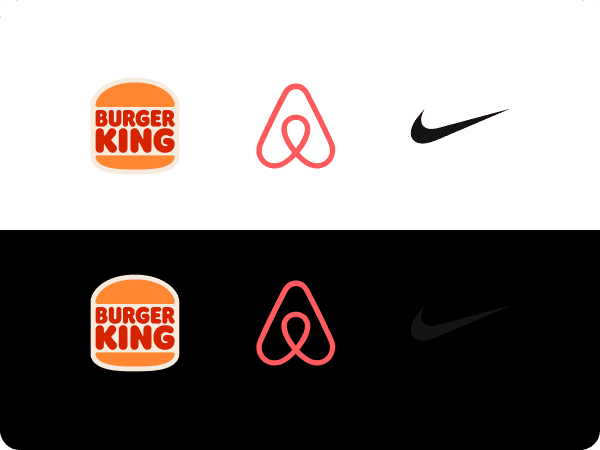
| Brand | White background | Black background |
|---|---|---|
| Nike | Totally readable | Invisible |
| Airbnb | Readable | Readable |
| Burguer King | Readable | Readable |
Burger King holds up on any background, not by accident, but by design. Their emblem-style logo has a built-in border that permanently separates the mark from whatever surface sits behind it. Dark background, light background, a paper bag, a cup, it doesn’t matter. That border guarantees contrast in every context. Whether intentional or not, it’s a masterclass in logo resilience.
Airbnb and Nike are both transparent, no built-in background, no border. They rely entirely on the surface behind them for contrast. This is where their paths diverge.
Airbnb’s coral tone gives it a natural advantage on the most common backgrounds. It reads on white, it reads on black, and it holds up on most mid-tones. But place it on a background close to that same coral, and it disappears just as fast as Nike does on dark. It’s not inherently “safe”, it just happens to work well in the most common scenarios.
Nike’s swoosh is pure black. That works beautifully on white and fails completely on dark. No color buffer, no built-in border, no fallback. Black on black is invisible, full stop.
This is the real dark mode logo problem: it’s not about logo style, it’s about color, transparency, and what’s sitting behind your logo.
Why email makes this harder to solve
On a website or in print, the fix is simple: detect the context, swap the logo. Light background? Use the dark version. Dark background? Serve the light one.
Email doesn’t work that way. You can’t rely on the email client to make that swap automatically, and you definitely can’t assume every client behaves the same way. Some invert colors. Some inject dark backgrounds. Some do absolutely nothing. The behavior is inconsistent across Gmail, Apple Mail, Outlook, and beyond.
That means the fix is entirely your responsibility. You need to anticipate dark mode and build the solution directly into your email!
The Options
There are four main approaches, each with its own trade-offs. We will use our logo as example, but as explained earlier, every logo has its own specific challenges, so remember to assume it and choose the best for yours.
The options are: As-is, Stroke, Outer glow, Drop shadow.
As-is

A black or dark logo on a transparent PNG will simply disappear against a dark mode background. No modifications means an invisible logo, this is exactly what we’re trying to avoid.
You could write specific CSS rules to force the logo section to always render with a white background, even in dark mode. It can work, but it’s not bulletproof. Those rules aren’t recognized across all email clients, so you would still be leaving a portion of your audience with a broken experience.
Stroke

Add a 1-2px stroke around your logo’s dark elements directly in your image editor: Photoshop, Figma, Illustrator, etc. It creates a visible separation from the dark background while staying relatively unnoticeable on light ones.
One practical tip: if your logo sits on a colored section – say, a light blue header – match the stroke color to that background. On light mode it becomes completely invisible, and on dark mode it still does its job.
Outer glow

Similar to the stroke, but instead of a hard outline you apply a soft luminous halo behind the logo elements. It’s a more refined result, especially for icon-based or symbol logos where a hard edge would look unnatural.
That said, it’s not the ideal choice for thin letterforms, the glow may not generate enough contrast to guarantee readability across all dark mode implementations.
Drop shadow

A solid drop shadow adds contrast between the logo and the dark background. It’s less visually intrusive than a stroke, but also less reliable. Depending on the logo, particularly thin letterforms, readability can still be compromised.
Bonus: CSS Swap

Some references, including the Nielsen Norman Group, suggest serving two separate logo versions using @media (prefers-color-scheme: dark) – one for light mode, one for dark. In theory it’s the most controlled solution.
In practice, we wouldn’t recommend relying on it alone. prefers-color-scheme isn’t supported across all email clients – Gmail being the most significant gap – and that’s too large an audience to leave unprotected.
Note: Outer glow and Drop shadow can technically be applied via CSS using the filter property, but we recommend against it for the same reason: support across email clients is too inconsistent. Apply these effects directly to the image file for guaranteed results!
Which should you use?
There’s no universal answer. It depends on your logo type, your technical setup, and your audience. But here’s an honest breakdown to help you decide:
| Method | Effort | Client Support | Best For |
|---|---|---|---|
| As-is | Low | Universal | Controlled layouts |
| Stroke | Low (image edit only) |
Universal | Most logos, fastest fix |
| Outer glow | Low (image edit only) |
Universal | Icon-based, symbol logos |
| Drop shadow | Low (image edit only) |
Universal | Complementary use |
| CSS Swap | Medium (2 assets, code & testing) |
Partial | When full control is needed |
Applying a Stroke or Outer glow directly to your logo file is the most universally reliable fix you can ship today – no code changes, no client compatibility concerns, works everywhere. This is particularly my favorite approach, and the one I use most.
If your brand guidelines are strict and a visible outline feels off, go one step further. Prepare a dedicated dark mode version of your logo (white or light-colored) and implement the CSS swap on top of your image-based fallback. That way, clients that support prefers-color-scheme get the pixel-perfect version, and everyone else still gets something that works.
The worst option is to do nothing and assume your subscribers will not notice. With 1 in 3 opens happening in dark mode, they will. Most brands overlook this critical detail. Getting it right is what makes your emails feel polished, professional, and brand-ready!
One article that we recommend reading (also related to email client limitations) is our guide on custom fonts in email. If this is starting to feel like a lot to manage on top of everything else, we offer email design and development services that handle exactly this: dark mode, custom fonts, and everything in between.


